Badge Area
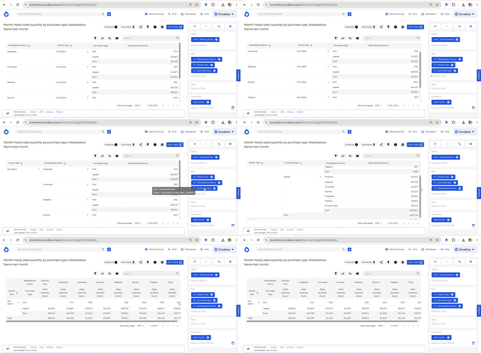
The Badge Area in Dive provides crucial context for any data query or visualization. It’s divided into four sections—each containing a dropdown of items (metrics, entities, filters, or time periods) relevant to your query. By selecting and ordering these items, you can customize how metrics and entities are applied to generate your visuals.
Sections
Metric Badges
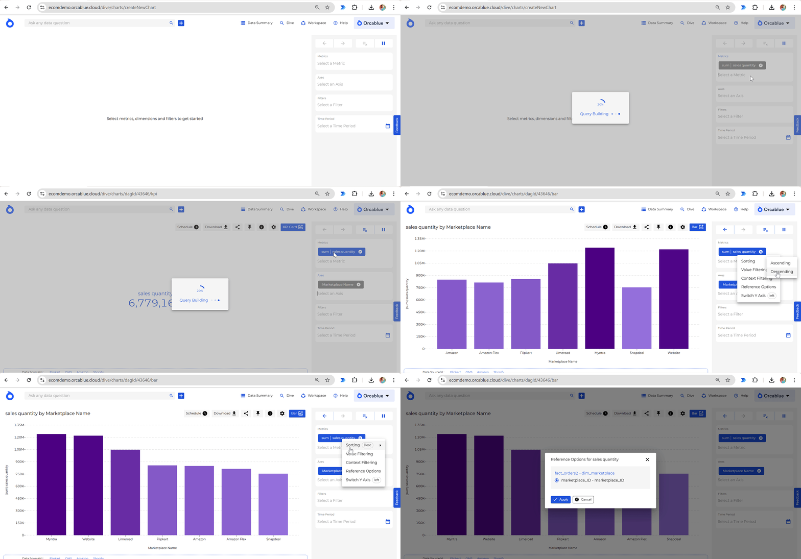
This section displays all metrics available in your data. Each badge represents a metric or KPI and provides actions to customize how the metric is presented in your chart.
Metric Badge Actions
- Sorting: Order metrics in ascending or descending fashion.
- Value Filtering: Set specific value ranges for metrics.
- Context Filtering: Add contextual filters to refine results.
- Reference Options: Add comparisons (e.g., year-over-year).
- Y-Axis Options: Switch the metric’s Y-axis to the left or right for multi-metric charts.
Entity Badges
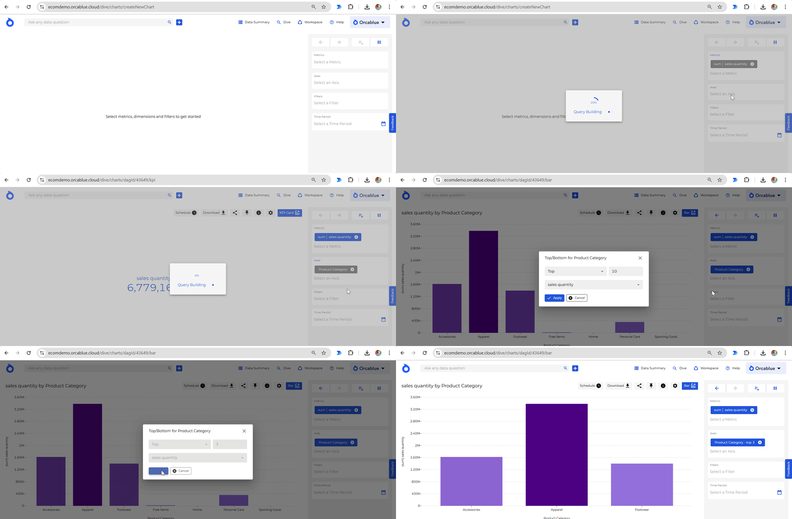
Here, all available entities are listed as badges. Each badge represents an entity or axis (like dates, products, or regions) used for analyzing metrics.
Entity Badge Actions
- Sorting: Arrange entities to organize results.
- Filters: Apply specific filters to refine the entity.
- Top/Bottom Filter: Display only top or bottom values based on chosen criteria.
- Ranking: Rank entities based on metric performance.
Filter Area
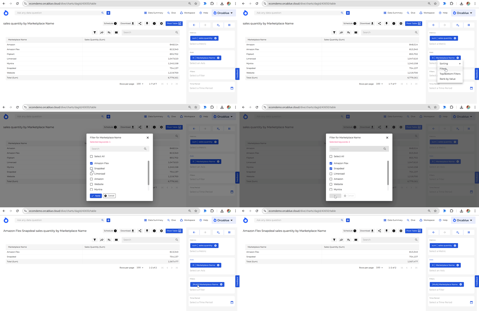
The Filter Area lists all entity item filters in the data. Each badge represents a specific entity item (or keyword) that can refine the data query for precise results.
Filter Badge Actions
- Convert to Not Filter: Exclude specific items from the query.
- Multi-Select: Select multiple items from an entity for compound filters.
Time Period
The Time Period badge allows you to filter data by specific timeframes. Choose a custom date range from the calendar or select from preset options like Today, This Year, Last Year, etc. These presets are dynamically calculated based on the current date.
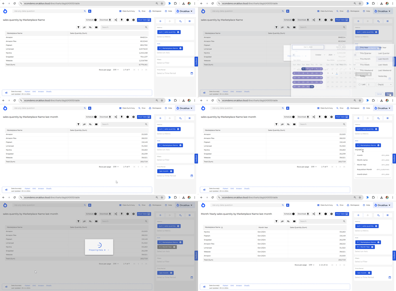
Customizing the query with order of the badges
The order of badges in the Badge Area determines how metrics and entities are applied in generating the chart. Adjusting the order can impact the visualization’s layout and provide more insightful results.
